36 Point Says Yes to SPEC!
![]()
Spec. It’s one of those topics that those outside of the design industry, people may not think twice about. The idea of having a competition for design services seams to make a lot of sense. You offer a prize, hundreds of designs come in, and you just select the best one.
I hear that it’s fairly common in Art. Maybe it’s not even frowned upon (chime in to let me know the official Art world stance if you know it). That would sort of makes sense as artists may already have work in their sketchbook that would look good for your mural. But your logo? No designer I know has one ready for you.
Nate wrote a post about the wrongs of spec last month, we even spoke for a half-hour about it on a podcast with Drew Davies, and AIGA has an official stance against it. But we have found a solution to all of the wrongs that doesn’t involve sabotage. So if anyone asks us – we’re in!
I break my major issues with spec as the following:
- Designers make money from their creative – so giving away creative for the remote chance of winning is a losing strategy.
- Without client interaction and feedback, true problem-solving is not going to occur. Even getting better information about the true target audience is hit and miss.
- What kind of value do you expect a client to give to your work if you give it away for the ‘chance’ of it ‘maybe’ being selected?
- The client possibly gets stolen clip art and a bad experience with working with designers.
So to solve all of these issues in one fell swoop, I offer this:
- Helvetica. Bold. 185 Red. All Caps. 36/36 (if more than one line). No revisions.
And when you really think about it, wouldn’t this look better than most of the winners anyway?
Sure it’s generic, but the target audience is most likely ‘everyone’. We don’t even have to bother reading past the name of the company, and we can create samples faster than we can reply with a no. If anyone asked for changes, we’ll just point them to this page. Why would you change it? Did you not watch Helvetica? It’s perfect as it is.
Let’s see what our sample looks like compared to the other entries in the Nebraska license plate competition:
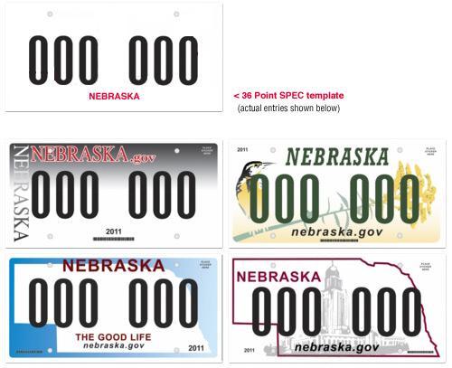
I think we have a winner.

Wow. If that was in the running, it’d have no competition.
We here in Indiana went through the same thing about a year back. We were forunate that the one that “won” didn’t look all that bad campared to the others.
http://www.in.gov/bmv/4639.htm
Cheers,
Bryan
I hope someone sends us an annual report. 250 pages of AWESOME.
Oh man…an annual report laid out in 36/36 Helvetica Bold would be the Peter Gabriel of annual reports.
Big Time.
I wish I had that kind of time…This whole license plate debate has already cost you 30 hours of design/thinking time…
Stop worrying about it.
What color should the dropshadow be?
Please don’t hit me.
No drop shadows. No revisions. Sorry.
Dear God. It’s beautiful. I weep at your god-like design feet.
36 Point entry for the win…
So what do we call this new aesthetic movement?
I like Spec Work Modernism myself.
Here’s what you do…package up your files for production…work up your invoice for at least $5000…and email both straight to the gov. Who knows, maybe it will get intercepted by some clerk that will blindly send it to account’s payable. If that happens I think I deserve 20 bucks for the idea ;)
Comments are closed.