Mwa ha ha! Back again two days in a row to bring you the complete story.
Matt outed me in the comments of yesterday’s strip — this whole thing has been building up to a parody of the greatest scary book of all time, The Spooky Old Tree, which does, in fact, star the Berenstain Bears. This riveting piece of illustrated fiction is a high-bar for the entire publishing world, as far as I’m concerned, and while my copy has long since been destroyed, the story sticks with me to this day.
If you’re no Lester Beall fanboy today’s strip may be a bit obtuse. Start here and come back whenever you’re ready.
This strip was an awful lot of fun to write and draw. I briefly considered turning this into our second episode of Force Justify, but I think I’ve figure out something a lot more fun. I’ve very excited for next week. Very.
Drawing every line of Milton Glaser’s most famous poster (is it? Now I’m not sure) gave a surprising amount of insight into how he drew that image. Which shapes he began with, which he filled in. It reminds me that we can call it design until we’re blue in the face, pour over every contour and detail and dissect them, but really that all started out as a man drawing. And if you’re a designer who loves to draw, there’s something very inspirational about that.
Have a good weekend. Freelancers keep those pens up –
The 36 Point / Life in Abundance Design + Benefit Poster is Featured on FPO
August 7th, 2009 | by Donovan Beery
My choice for best summertime website distraction for designers, FPO: For Print Only, selected our Life in Abundance poster for today’s feature. Check out the post to not only get some better pictures of the completed project, but some in-progress photos provided directly from Spark Stationery.
The 36 Point / Life in Abundance Design + Benefit Poster Update
March 19th, 2009 | by Donovan Beery
Some great designers say they’d come visit us for the one-year mark of The Reflex Blue Show, and to record Episode #29. We took them up on it. Then we locked them in a room for an entire Saturday and made them work. February 28th in Omaha isn’t usually great out, so we really didn’t feel too bad about it.
It was Steve Hartman of Creativille, Justin Ahrens of Rule29, and Christine Taylor of Hallmark. Somehow Nate and I were there too, and we felt our guests’ creative powers dwarfing ours in a 12′ x 9′ room. The goal was to design a poster that Life in Abundance (LIA) could sell to raise funds for their work. This entire project was made possible by the great people at Spark Stationery and Neenah Paper. (Use them when you can – they’re both great.)

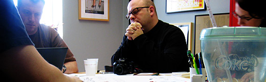
None of us (other than Nate and I doing some projects together) had worked together on any projects in the past, and we had purposely not given anybody any details before they arrived. The project was designed to start with a fresh perspective from everybody.
How do we start? We didn’t know, but thought we’d first share an email we got from Spark Stationery with some tips for designing for letterpress. Then we handed it over to Justin, who gave a brief talk about LIA (he’s been doing quite a bit of work for them), and he finished by showing us a video of the effect they have on the people they help.
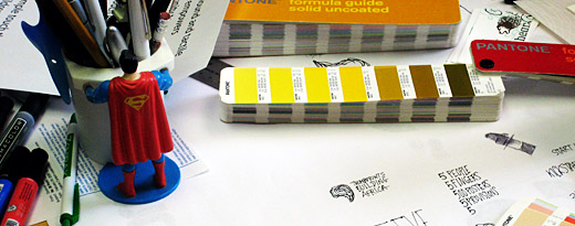
Pens and large sheets of paper were on the table when we started. Naturally, with five creatives and caffeine at the same table, doodling began, followed by ideas. We agreed on an idea to go with just as lunch was to occur.

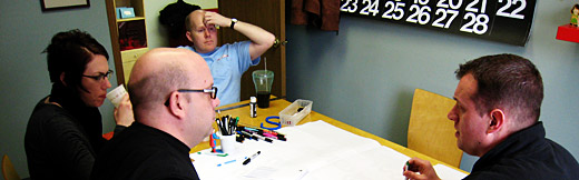
After grabbing a bite at Runza, the computers came were freed from their bags, and we naturally gravitated to different aspects of the project to work on. The goal to finish the poster before we left was met. Sort of. Justin wanted to do some type cleanup, and go over the files to make check for the little things that get glossed over in a time crunch. I wanted to check with our sponsors on the wording of the credit lines.
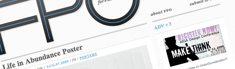
We ended up with a concept that requires five letterpress color plates, and an additional one as a blind emboss. As we are now, the files and paper (Eames™ Furniture, Solar White, 120lb Cover) from Neenah Paper have been sent to be printed by Spark Stationery, who’s printing is always incredible. The poster should be available for sale on May 1, 2009. We’ll be posting photos when we get them in.
To be updated when we get photos of the poster, and when they are available for purchase in the LIA store, join our Facebook group, follow us on Twitter, or subscribe to our RSS Feed.
The entire purchase price of the posters will be going to a good cause too: Life in Abundance works in urban and rural slums of Northeast Africa on helping to empower the most marginalized in areas of education, Aids, healthcare, sanitation, poverty and more by equipping communities to rise above their circumstances.
Chicago International Poster Biennial Entries Gallery
May 14th, 2008 | by Nate Voss
Created with Admarket’s flickrSLiDR.
Post your entries to the 2008 Chicago International Poster Biennial on Flickr and join our group.
Thousands, perhaps millions of posters will be entered and only 100 will win, so we at 36 Point wanted to showcase as many of the entries as possible to help celebrate poster designers around the world. This gallery is built to house those.tif files that are required of the entry process, so once you send yours off, load them up!
If you don’t have a Flickr account and hate free things that are awesome, post a link to your entry (jpegs please) in our comments and we’ll see that it gets added to the group. Please be sure when adding images to our group, to set their permissions to “public.”
Winners will be announced by the CIPB in the Fall of 2008. Good luck!


Nate Voss is a designer, illustrator, talkshow host and design journalist. Working in Omaha since 2001, Nate served four years on the Board of Directors for
Donovan oversees all creative development at