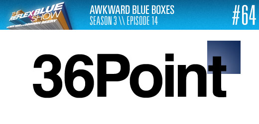
Robert Maguire (@welcomehomerob on Twitter) stops by to discuss some happenings at The Gap with Nate and I. I have been on record saying putting things in Helvetica Bold will make them look better than most things out there with no additional effort. Ends up that adding a weird blue box to it has the reverse effect.
We had planned on another topic, but that will have to wait for next time. Discussing this story was something we found out we had way to much of a take on to find time for much else.
If you disagree, leave a comment below. Comments left with a floating blue box behind them get extra credit.
Download The Reflex Blue Show, Season 3 Episode 14 or, click here to subscribe to The Reflex Blue Show from the iTunes Music Store.
Podcast: Play in new window | Download

