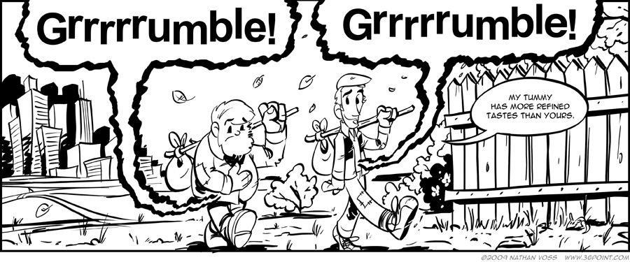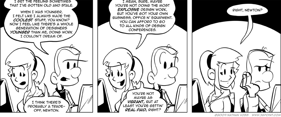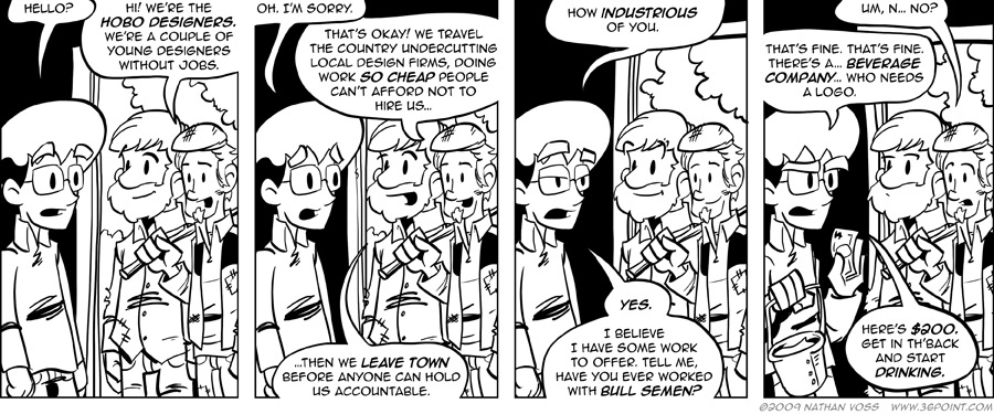
This is going to be one of those strips where I have to remind my friends that our two heroes are in fact, young, single designers, not the ragged old men they were originally based upon.
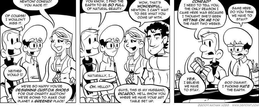
Yesterday we were invited to make beauty happen upon shoes as a part of a fundraising drive for the Green Omaha Coalition. We like those people. The guest list of artists ranged from local radio celebrities, to a very talented industrial/product designer, and, somehow, to us. While I struggled against the medium of “shoe” to apply my trade, landing somewhere between the intended thought and the blurry, middle-school art projects of my past, Donovan erupted as a gladiator of artistic passion and strength, barely looking up or aware of anyone else being in the room. I’m pretty sure most people thought we had a sort of Penn & Teller thing going on.
The shoes go up for auction at some point today, and when they do we’ll be sure to link the holy crap out of them.