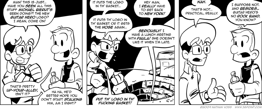
Apologies for the big, long Labor-Day break. I spent it working, which is, as they say, a problem I’d like to have, but sitting down to do today’s comic, which was meant to be posted last Friday when this kind of news was still relatively new, felt like going back to Calculus after spending a whole summer forgetting how to do it.
If you missed it, Michael Bierut, perhaps the nicest design mega-star (again, if there even is such a thing), brought two of my worlds together when he announced on the Pentagram blog that his team handled the new iteration of the Guitar Hero logo. This, of course, includes an entire Guitar-Hero typeface design, and endless visual interpretations that seem to center on fire and rock. Brand New, of course, has a great dissection of it as well.
Bierut gets the credit, and I really don’t have a problem with that, but the actual designer on the project was a fellow by the name of Joe Marianek, and the typeface itself was designed by Kai Salmela. The common problem with working at Pentagram and not being Michael Bierut or Paula Scher (or any of the other 18 or 19 partners) is that you often get overlooked by the masses when you do something awesome. The way around this, or so I’ve heard, is to start four or five of the most successful design websites ever, and even then you still have to quit to get noticed.
But it’s still no Rock Band.


