365 29: Why Did They Have to Make it Bigger?
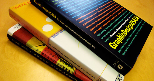
Before I joined AIGA some seven years ago, members were mailed a copy of the organizations’ Awards Annual (now called 365) in all of its hard-bound, heavy glory. Somewhere between the copy I later found of issue 18, and my first issue, 23, the shelf-height started varying, as well as the cover material.
Issue 24 came in 2003, and had a fuzzy orange color. Me being a sucker for orange, I loved it. As the years pass, the fuzzyness left a nice tarnished stain on the white cover of issue 23 that it shares a shelf with. Like a Sagmeister design experiment, it was destroying the book next to it, I have since changed my opinions on this tome. Even the orange cannot stop my dislike of it anymore.
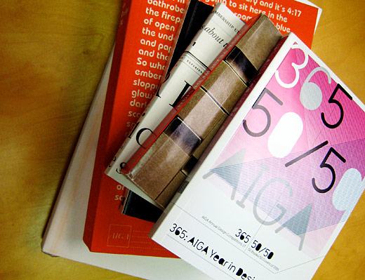
Then, in 2004, a smaller box than usual appeared in my mailbox. Issue 25. Outrage. The book was no more. A pamphlet was sent in its place. Ric Gréfe, the AIGA executive, was questioned about this by some, including myself when we had him on our previous podcast. Sustainability was part of the answer. The Internet was the other part.
I saw his point. How many people get the annual compared to how many would potentially see it online? The AIGA Design Archives had been started, and the resources were going there. As the years past, the online archive took shape, and I actually began to fully agree with his statements. The online archive was where it was at, and where people like myself would go to view the selections. I open the pamphlet the day I get it, and then it sits on my shelf to collect dust and remnants of that nasty orange cover next to it.
The online archive became so easy to use and search, I started using it to show examples in class. AIGA’s 365, because of this permanent online database, as well as the physical pieces accepted going into both the AIGA National office and the Denver Art Museum, became what I would consider the top design competition. It was just above Communication Arts in my mind.
I quit caring about the small books/pamphlets as the arrived in my mailbox, simply setting them on the shelf to turn orange from the large format of the past. 4 years went by until last week when 29 arrived.
It was big. They made it bigger.
The 365 book was back to its full-size, and really, I looked at this one much less then any of the previous 6. Why would I? I had already seen the pieces online. Maybe sustainability got overruled by Paula Scher’s design. It is possible that the economy rebounded in the last month completely, and printing a giant book when a pamphlet has been doing fine seemed like a good idea.
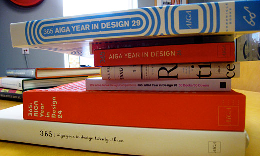
I still rate 365 at the top of the design competition pyramid, but the book being large enough to squash all 4 of the ones immediately before it has nothing to do with it. And with all the talk of green, and sustainability? The design of 365 29 is great, but the thought behind making it bigger now feels outdated. I miss the pamphlet. It stood for what we should be spending resources on. This feels like a product of past thinking. Am I wrong?

I think it is the difference between print designers and web designers. I’ve seen some positive opinions about the bigger size in other places around the web. Personally, I like my art big and my design small. That’s just me though.
Anyway, here is Paula’s quote from the Pentagram website:
“My major goal for the annual’s design was to make it bigger.â€
Mine is lime-green. Apparently they also have dark green and pink. What’s the purpose in that?
I dunno, I always respectfully disagreed with Ric and liked the larger book format, so I was stoked they made it bigger. I see your point, though.
Oh, and mine is the pastel blue color as well.
Donovan, As a purveyor of print and a stayer away from web, I fully embrace the back-to-full-size annual. I would rather flip through a real book and see good photography, than “zoom in” in the online archive. The archive has its place, but so does a moderately sized design paperback annual.
I’m assuming/hoping that this book didn’t cost the AIGA any more money than last years thumbnail book. I guessing that Chronicle picked up some of the tab and now has the rights to sell it commercially.
And why do we need a reason to have four different colored covers (btw green, blue, yellow and pink)? Oh and Paula does have at least a justification, “The cover has been printed in four different colors (to help distinguish your copy from your studiomate’s) . . .”
Oh yeah, I still like fuzzy the orange one. It has never destroyed any of my books.
Nice read! Why DID they make it bigger. The size used to be a very cool aspect making it an easy desktop keeper for a quick spark. I’m with Adam D. That quote is great. “I like my art big and my design small”
I think for some, there is this notion that the possession of an object, whether printed piece or artifact, demands our attention because we can grasp it, hang it on the wall; they are anchors because they are physical and thus more important. Whereas in the digital realm, things seem less permanent or more disposable; intangible, in a sense.
Likewise, I enjoy the online design archives. Maybe I’m the only one of the opinion that thinks it is easier to scan the best of design for the year, as well as 50/50, in a single printed format.
I like the book, and hope AIGA continues to publish it.
Then there’s always the chance that one of your design works gets selected for the book, in which case you can add AIGA:365 to your resume in the published category.