Everything Looked Better in 1940

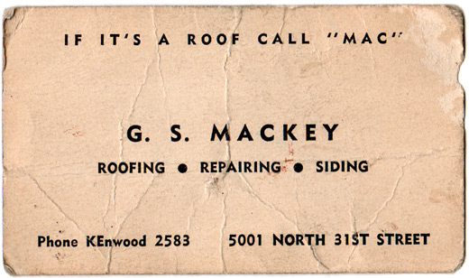
Spending the weekend after Thanksgiving working in the attic, my wife found a business card laying in the insulation.
Since we had the original asbestos slate shingles replaced last year, we assume this is the business card from the original roofer of our house in 1940. And now I know why everything looked so good back in the days before America’s involvement in the war – there were obviously no client demands about how much information needed to be on items like their business cards.
Do you need a city, state and zip code? Like we’re doing work outside of Omaha?
Do you need your fax, cell and office phones listed? What?
How about your website and email address? Are you drinking whiskey at 7 in the morning?
Maybe a nice photo of a roof or a shingle? I think If it’s a roof call “Mac” will get the point across.
Type choice limitation really helps in instances like this. No need for a half dozen fonts when you don’t have access to them. And thankfully Comic Sans is still 54 years away.
And dealing with phone numbers only four digits in length? Too bad the 1960s killed that one…


Mmmmm. Great use of Futura, though the numerals look different.