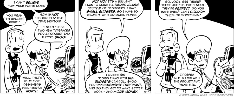
Over the weekend I was working up some design concepts for a new client project. In my head I crafted the perfect set of type, to move and play off one another in a beautiful dance filled with rounded slab-serif italics and contrasting weights. Then my world came crashing down around me when I saw the pricetag — which was not exaggerated for today’s strip.
My disappointment turned into anger, and from anger to feelings of persecution. My client deserves a perfect solution to their design problem, as does any client. But my client can’t afford a perfect solution, and I cannot justify four hundred dollars for two typefaces. In my entire career, I have never, ever been able to justify the purchase of a typeface for a project. Not when I was working for an employer, and not now that I work for myself. Maybe at the $50 range, and maybe once. Even then, we’re talking about a single style at a single weight. For fifty. Dollars.
I’m of the opinion that typographic design world faces a similar problem the music industry faced a few years ago — only worse. Essentially they’re selling computer software, and when you sell computer software, you deal with piracy. Sadly, type designers also have to deal with amateur hour over at every 1001 free font dot com in the world, peddling crap that just might work for us designers (like Anime Ace, the current type that 1PT.Rule is set in) when we can’t afford the real deal. Did I go to Veer and House to check out type when I started this strip? Hell yes. Did I balk at the pricetag and settle for less? Hell also yes. If you think graphic designers have it bad justifying work and pricetags in the face of amateurs and undercutters, I can tell you we’ve got nothing on type designers.
So in order to combat those issues, and make the most of the sales they get, new type designs are priced sky high. This also demonstrates the principle of value-through-price-point, as in, “our type is better because it is wicked expensive,” a marketing trick that almost all of us fall for every single day. My problem is that this has created a serious barrier for entry for those of us with small operations and small-budgeted clients. So it is in fact tougher for the little guys to produce big design — despite talent, enthusiasm, knowhow, and need.
To this day I believe that Helvetica Bold should cost $5. Helvetica Bold Italic should also be $5, and they should be sold through an iTunes-like service that also manages the fonts on your computer system. An iTunes Music Store for fonts, with matching appropriate pricing. Granted, Helvetica Bold Italic is not going to sell near as many copies as Lady Gaga’s latest single, but under this model it would solve at least the piracy problem (look at iTunes’ $1 price-point effect on music piracy for the general public) and by making the great typefaces as readily available as the crap out there for free, you stem the tide of garbage in, garbage out from designers using them.
I could go on. For $400 I could buy a Dyson, a Playstation 3, a Kindle, or two iPhones. Or two fonts. I know they take a long time to make and are a delicate craft, but after eight years and maybe only one purchase, how can these prices be justified?