I had the opportunity this week to be interviewed by Clint Walkingstick of Eye Say (and one of the guests on The Reflex Blue Show HOW Conference Special: DAY TWO). The questions focused on making the leap to being an in-dependent designer. You can read the interview at the Eye Say Web Log here.
Archive for Donovan Beery
I can’t believe it’s already been over two months since we got four designers into a Honda Civic to drive eleven hours from Omaha to Memphis and back in just over four days of time. The event? The AIGA National Design Conference. And on opening night October 8th, Nate and I were invited to be part of the 20/20 hosted by Debbie Millman.
The rules were simple: 1) Be on stage while your presentation was going on and 2) Keep it to sixty seconds.
To see what we, and the other speakers had to say, see the video at the AIGA website here. Our presentation was the first of the group, so we start right after Debbie introduces the event.
Last year, our limited holiday card to friends and family took a change to a postcard format. We really don’t write a letter, so the need for the extra space was not an issue.
One inspiring creative sharing one piece of advice, all over iChat.
This is the vision of Mig Reyes‘ (he of The Reflex Blue Show student tips ever since his appearance on the podcast) newest venture. Humble Pied launched less than a month ago, but has already built up a solid amount of content from designers across the nation.
36 Point was honored to have been asked to contribute advice for today’s post. To hear what we said, view the post here.
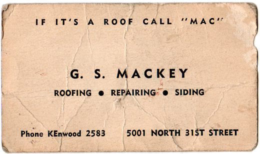
Spending the weekend after Thanksgiving working in the attic, my wife found a business card laying in the insulation.
Since we had the original asbestos slate shingles replaced last year, we assume this is the business card from the original roofer of our house in 1940. And now I know why everything looked so good back in the days before America’s involvement in the war – there were obviously no client demands about how much information needed to be on items like their business cards.
Do you need a city, state and zip code? Like we’re doing work outside of Omaha?
Do you need your fax, cell and office phones listed? What?
How about your website and email address? Are you drinking whiskey at 7 in the morning?
Maybe a nice photo of a roof or a shingle? I think If it’s a roof call “Mac” will get the point across.
Type choice limitation really helps in instances like this. No need for a half dozen fonts when you don’t have access to them. And thankfully Comic Sans is still 54 years away.
And dealing with phone numbers only four digits in length? Too bad the 1960s killed that one…